Published August 12, 2026
Qi Gong calligraphy explained: the man who declined an imperial surname, the structural theory behind his slender script, and how to assess a sheet.
He was born into the imperial clan and spent his life refusing to say so. Qi Gong (1912–2005) descended from the Manchu house that had ruled China until the year of his birth, and he could have signed his work with the Aisin Gioro name that came with that descent. He never did. He signed two characters — Qi Gong — and when correspondence arrived addressed to the clan name he was known to send it back. For a man whose entire art was the writing of names and phrases, the decision about how to write his own was not a small one.
This guide covers who Qi Gong was, what distinguishes his script from the many hands that imitate it, the structural theory he built and taught, why his work as an authenticator matters to anyone buying his calligraphy, and what to examine before you buy a sheet.
A scholar without the usual credentials
Qi Gong's career ran through Beijing Normal University, where he taught for most of his working life, and it began without the paperwork such a career normally requires. He did not arrive as a conventionally credentialled graduate. He arrived because the historian Chen Yuan — one of the formidable scholars of the Republican period, and the teacher Qi Gong spoke of for the rest of his life — decided the young man could teach and gave him the chance.
That debt shaped his behaviour with money. In later decades, when his calligraphy was in demand and could be converted into substantial sums, Qi Gong directed proceeds into an endowment at the university named for his teacher's studio rather than into his own affairs. It is worth knowing this before you look at his writing, because his script is often described as modest, and the modesty was not a stylistic affectation.
He was also, by temperament, a self-deprecator. He wrote a mock epitaph for himself which listed his deficiencies before it got anywhere near his honours — the joke of a man who had watched the twentieth century remove every social advantage he was born with and had decided to find that funny rather than tragic. You can find Qi Gong on our artist roster, and the tone of the writing is not separable from the tone of the man.
What "Qi Gong style" actually looks like
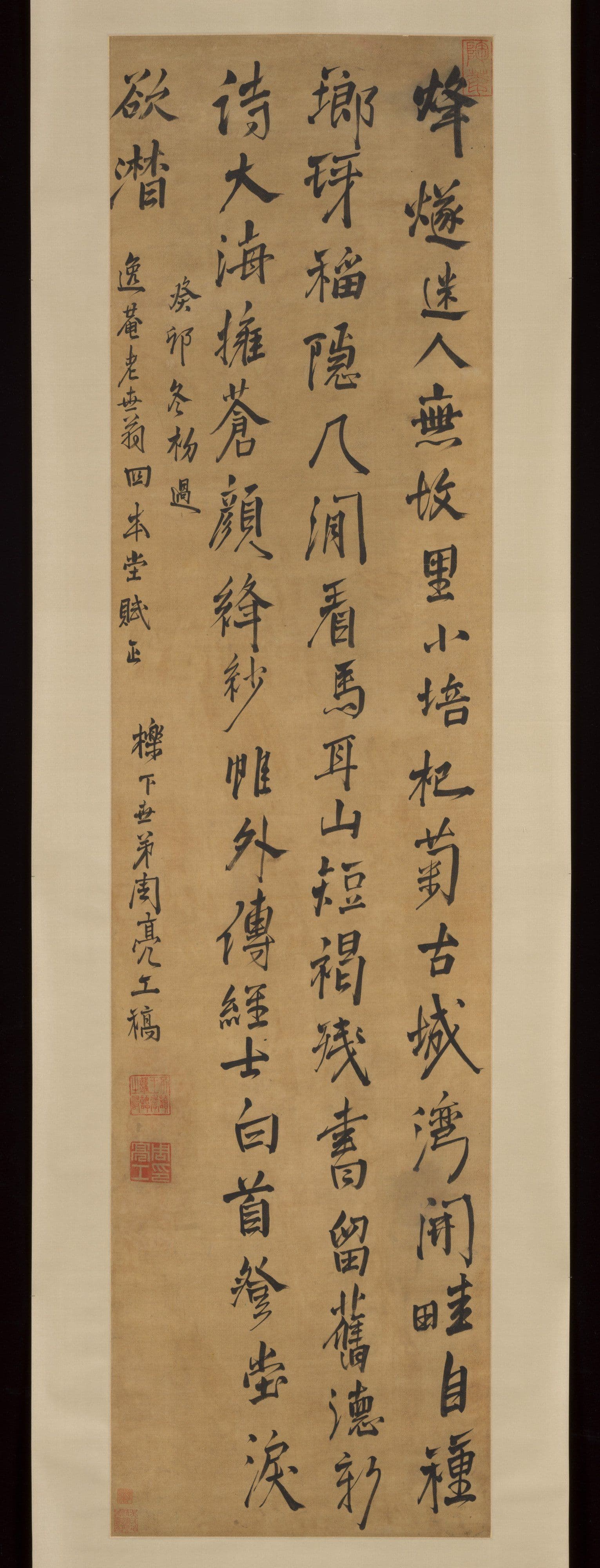
Qi Gong's hand is one of the most recognisable in modern Chinese calligraphy, and it is recognisable for a slightly unusual reason: it is legible. Where much twentieth-century brushwork pushed toward expressive distortion, his went the other way, toward clarity, uprightness and control.
The consistent features:
- Slender strokes with high tension. The line is thin relative to the character's size, held taut rather than allowed to swell. There is very little wet, heavy loading of the brush.
- An upright, slightly elongated frame. Characters stand tall rather than square. They do not lean, and they do not sprawl.
- Long, decisive extensions. Horizontal and diagonal strokes that are permitted to run travel confidently to their end and finish cleanly, giving the writing its open, airy quality.
- Regular script and running script as the home ground. His reputation rests on kaishu and xingshu rather than on wild cursive. He worked comfortably within the disciplined end of the five script types.
- Spacious column setting. Generous room between characters and between columns. The white of the paper is doing real compositional work.
The overall impression is of scholarly restraint — a hand trained on classical models and on the stone-inscription tradition, then simplified until nothing decorative remained. It is a long way from the deliberately archaic, weight-bearing manner of clerical script, and that distance is intentional.
His hand became so identifiable that it was eventually digitised as a typeface, which is a genuinely double-edged fact for collectors. It made the style universally familiar. It also gave every copyist in the country a reference standard to work from.
The structural theory behind the hand
Qi Gong's most durable contribution to calligraphic teaching is not a stroke technique but an argument about where a character's structure actually lives.
The traditional teaching apparatus is the squared practice grid — the character centred in a box, its balance point assumed to sit at the geometric middle. Qi Gong disputed this. His position, developed over decades of teaching, was that the visual centre of a well-formed character is not its geometric centre, and that the decisive junctions — the points where the eye registers whether a character stands or falls — sit off-centre, at proportionally divided positions within the frame.
The practical consequence is what you see in his own writing. Characters that should look unbalanced by the ruler look stable to the eye, because the weight has been placed where perception wants it rather than where the grid says it belongs. When people describe his script as "structurally precise", this theory is what they are describing.
For a collector, the theory is useful in a specific way: it gives you something to test. A convincing Qi Gong sheet holds its balance at speed. A copy usually betrays itself in the structure long before it betrays itself in any single stroke, because the copyist is reproducing shapes rather than applying a rule.
The authenticator's eye
Qi Gong was not only a producer of calligraphy. He was one of the twentieth century's significant connoisseurs of ancient Chinese painting and calligraphy, serving on the national panels that examined and graded early material held in public collections. Much of his scholarly life was spent deciding whether things were what they claimed to be.
This matters to buyers for two reasons.
First, it explains the range of his own output. A great deal of surviving Qi Gong material is not grand hanging-scroll display work but inscriptions, colophons, title slips, dedications and academic occasional pieces — the written apparatus that surrounds other objects. If you are learning to read that apparatus, our guide to reading inscriptions on Chinese paintings covers the conventions he was working inside.
Second, it explains the peculiar forgery culture around his name. Qi Gong was one of the most widely imitated calligraphers of his era, and stories circulate — repeated often enough to be part of his public legend — of his cheerful, unbothered reaction to being shown fakes of his own work. Whatever the truth of any individual anecdote, the underlying situation was real: the fakes were numerous during his lifetime, they are more numerous now, and his good humour about them is not a warranty you can rely on.
What to check before you buy
Approach a sheet in this order.
Structure before strokes. Look at the whole column from a distance first. Do the characters stand? Is the spacing confident, or is it fussy and cramped from a hand that was concentrating? Copyists tighten up.
Line quality under magnification. A period Qi Gong stroke is thin but not weak — it has continuous tension and clean entry and exit. Hesitation marks, retouched edges, and strokes that were gone over twice are all disqualifying.
Paper and ink behaviour. Ink should have sunk into the sheet with a slight, natural feathering at the fibre level, not sat on the surface as a printed line would. Check under raking light for the plate impression or dot structure that betrays a reproduction sold as original.
Seals and signature, assessed last. Seal impressions should show the uneven pressure of a hand-pressed seal, with paste sitting on the fibres rather than printed flat. Read them properly rather than pattern-matching against an image — our walkthrough on identifying a Chinese artist's seal step by step sets out the method.
Provenance and paperwork. For a modern master this close to living memory, documentary history is realistically obtainable, and its absence should affect what you pay. Insist on written condition and attribution language on the invoice.
Two honest cautions. Certificates issued by the seller are not independent evidence. And no article, this one included, can substitute for physical examination or a specialist opinion on a sheet you are actually considering; the guidance above is for narrowing a field, not for closing a deal.
Common questions
Is Qi Gong considered a painter as well as a calligrapher?
Yes, though the calligraphy carries the reputation. He painted in the literati manner — landscape, bamboo, orchid, plum — with the same restraint that governs his writing, and his paintings are typically inscribed in his own hand, which is part of their interest. Collectors generally encounter the calligraphy first because far more of it exists.
Why is his work forged so heavily?
Three factors compound. His style is highly consistent and therefore easy to study; it was digitised as a typeface, giving imitators a reference; and demand for his name has been strong for decades. Consistency, which is a virtue in the artist, is an opportunity for the copyist. Treat any unprovenanced sheet as unproven until examined.
Does Kiln & Ink sell original Qi Gong calligraphy?
No. We do not deal in original manuscript calligraphy. What we offer is a limited-edition archival reproduction — Mist Shining in the Sun — printed on fine paper, hand-numbered, and issued with a Certificate of Authenticity that describes it accurately as a reproduction. Anyone selling you an "original" should be able to document it; we would rather be clear about what we are.
Where should a new collector of his work begin?
With looking rather than buying. Spend time with securely attributed examples in museum and institutional collections until the structural logic described above becomes obvious to you at a glance. The best protection in this particular market is not a checklist but a trained eye, and it costs nothing but time to acquire.
Further reading
- Wu Changshuo and the Stone Drum Calligraphy — the archaic-stele training that shaped calligraphers of the preceding generation.
- Collector Seals on Chinese Painting and Calligraphy — the ownership marks that accumulate on a sheet over time.
- Seal Script (Zhuanshu) — the ancient end of the tradition he studied.
- Rubbings and Stone Inscriptions — the stele material that trained calligraphers of his generation.
Browse the collection
Kiln & Ink sells paper: limited-edition archival giclée reproductions of the twentieth-century Chinese ink masters, printed on xuan paper or museum-grade cotton rag, hand-numbered, and issued with a Certificate of Authenticity.
Explore Further