Published August 11, 2026
Clerical script (lishu) explained: the Han dynasty hand of Chinese calligraphy, its flared wave stroke and wide flat proportions, and how to recognise it.
Unroll a Chinese handscroll and the first characters you meet are usually not the painting's inscription but the title slip written across the frontispiece — and very often those characters are wider than they are tall, with horizontal strokes that begin with a blunt tucked head and end by lifting into a broad flared tail. That is clerical script, lishu, and its job on that title slip is exactly what it has been for two thousand years: to look formal, legible and old at the same time.
Clerical script is the hinge in the history of Chinese writing. It is the hand that broke the seal-script tradition and made everything that came afterwards possible, and it is the one script a collector meets constantly on frontispieces, couplets, seal side-inscriptions and rubbings without necessarily being able to name it. This guide covers what changed when lishu arrived, how to recognise its signature stroke, which monuments define the canon, and how to judge a piece of clerical writing when it is in front of you.
What lishu replaced
Seal script — zhuanshu — is the older hand: characters taller than they are wide, strokes of nearly even width running in curves, the whole thing built for balance and symmetry rather than speed. It is beautiful and it is slow, and slowness became a practical problem as the imperial bureaucracy grew and the volume of documents grew with it.
Clerical script is what happened when working scribes flattened that system out. The change had three parts, and all three are visible to the eye:
- Curves straightened. Rounded seal-script arcs resolve into straight horizontals and verticals meeting at angles.
- Stroke width began to modulate. Instead of an even line, the brush is pressed and lifted within a single stroke, so the stroke thickens and thins.
- The character proportion inverted. Seal script is taller than wide; clerical script is wider than tall, sitting on the page in a broad, stable rectangle.
The name itself points at the origin — the clerks. This was a working hand, developed under administrative pressure and then, in the Han period, elevated into the formal script of monumental stone inscriptions. That double life, practical and monumental, is why it looks both plain and ceremonious.
If you want the wider map — where lishu sits relative to the other four hands — the five scripts of Chinese calligraphy guide lays out the whole sequence, and the seal script guide covers the hand lishu displaced.
The silkworm head and the wild goose tail
One stroke defines clerical script, and if you learn to see it you can identify lishu across a gallery.
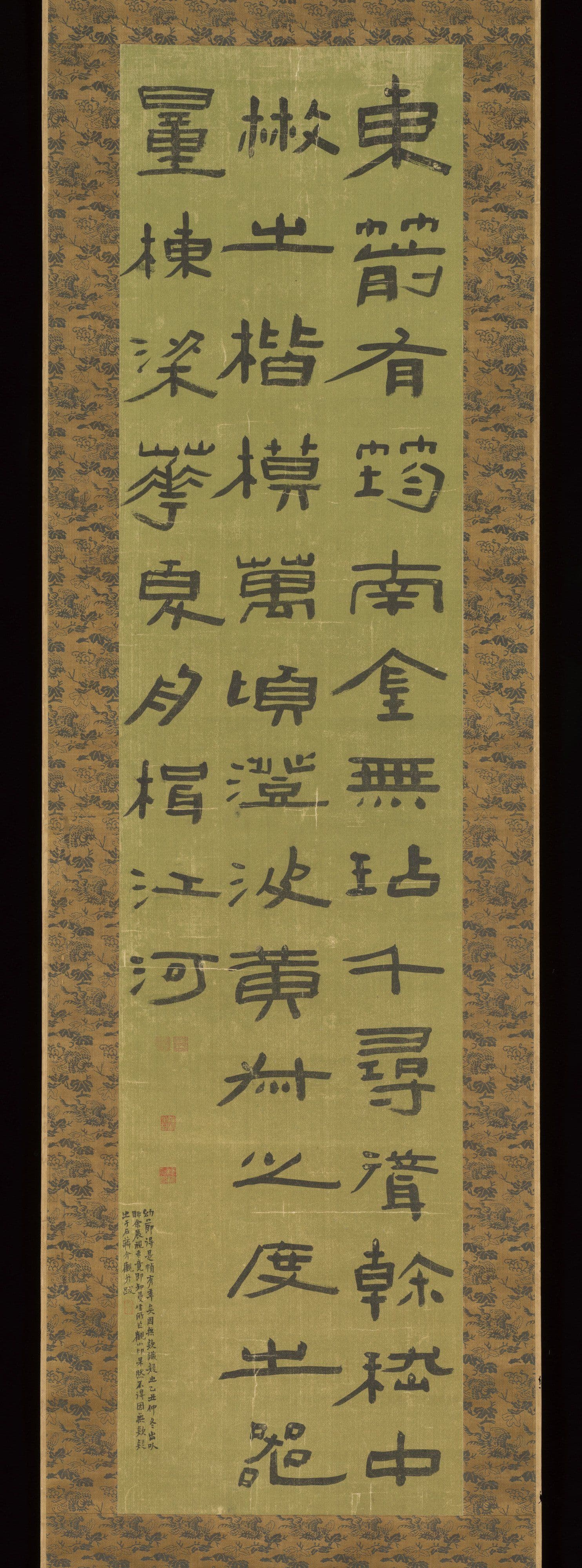
The dominant horizontal stroke is described in Chinese by an old and unusually literal phrase: silkworm head, wild goose tail (cantou yanwei). The brush enters by tucking back on itself, producing a blunt rounded head like the head of a silkworm. It then travels horizontally with pressure, and at the end it presses down and lifts away to the upper right, flaring into a broad diagonal tail — the wing of a goose taking off.
Two conventions govern it, and both are useful diagnostics:
Only one stroke per character gets the flare. Calligraphers put this as geese do not fly in pairs — if a character has several horizontals, one is chosen to carry the flared tail and the rest stay restrained. A piece of writing in which every horizontal flares reads as loud and unschooled; it is one of the quickest ways to spot an amateur or decorative imitation.
The flare is a lift, not a hook. Regular script (kaishu) has its own ways of finishing a stroke, usually with a downward press or a small hook. The clerical tail goes up and out. If the terminals are turning down, you are looking at regular script that has borrowed some clerical width, which is a common modern hybrid.
Beyond that one stroke, look at the overall silhouette. Clerical characters spread horizontally, the interior spacing is open and evenly distributed, and the vertical axis is calm. Compared with running script, nothing is connected; every stroke lifts clear of the paper before the next begins.
The Han steles, and why they matter to a collector
Clerical script's canon is carved, not written. The Eastern Han period produced a body of stone stelae that has served as the model for every serious student of lishu since, and their names circulate in the market because rubbings taken from them are themselves collected.
The character of the canon is worth knowing because the styles differ sharply:
- Cao Quan — elegant, slender and graceful; the model that appeals most immediately to a modern eye.
- Yi Ying — balanced and orthodox; the standard teaching model.
- Zhang Qian — blunt, square and heavy; deliberately unrefined strength.
- Shimen Song — loose and open, cut into a cliff face rather than a dressed stele; unusually free.
A collector meets these as ink rubbings — sheets taken directly from the stone surface, black ground with the characters reserved in white. Rubbings are a distinct collecting field with their own criteria of age, clarity and completeness, covered in our Chinese rubbings and stone inscriptions guide. The practical point for anyone buying calligraphy: when a modern piece is described as "after the Cao Quan stele" or "in the manner of Zhang Qian", that is a specific stylistic claim you can check against the model, not a vague compliment.
The Qing revival, and the artists it produced
Clerical script went quiet for centuries. Regular and running script dominated the elite tradition from the Tang onward, and lishu survived mainly as a formal script for titles and headings.
What brought it back was scholarship. From the eighteenth century onward, Chinese scholars became intensely interested in ancient bronze and stone inscriptions — a movement usually called the stele school (beixue) — and that antiquarian research fed directly into practice. Calligraphers began working from Han stelae and Qin seal-script models rather than from the copybook tradition of Wang Xizhi and his descendants, and the result was a genuine revival of the archaic hands in original, sometimes eccentric, form.
Three figures anchor the period for a collector. Deng Shiru is the pivotal one, a professional calligrapher who rebuilt seal and clerical script as living hands. Yi Bingshou developed a clerical style of extraordinary breadth and severity, with strokes of nearly uniform thickness and characters that fill their space almost architecturally. Jin Nong, one of the Yangzhou eccentrics, pushed clerical forms into the flat, blunt-ended manner known as lacquer script, which looks less written than constructed.
This is the milieu that produced the generation Kiln & Ink's own catalogue begins with. Wu Changshuo came out of exactly this antiquarian current — his life's study was the Stone Drum inscriptions, an archaic seal-script monument, and that grounding in ancient carved letterforms shaped his painting as much as his writing. Our guide to Wu Changshuo's stone drum calligraphy covers how that study translated into brushwork, and the same charged, archaic line runs through paintings like Lotus Flowers.
Where you will actually meet lishu
Clerical script rarely carries the main inscription on a painting — that is usually running script. It shows up instead in specific, predictable places, and knowing them saves you time:
- Frontispiece title slips on handscrolls and albums, where formality is wanted.
- Couplets hung as a pair, a very common format for clerical writing.
- Seal side inscriptions, the small carved text on the flank of a seal stone recording the carver and occasion.
- Signboards and hall names, historically and in reproduction.
- Rubbings of the Han stelae themselves.
Because these are formal contexts, clerical script is disproportionately the hand you see on the outside of things — the label, the title, the frame around the work — which is exactly why it is easy to look past. When you are reading a painting's inscription and signature, the running-script conventions in how to read a Chinese painting inscription will do more of the work.
How to judge a piece of clerical script
Four questions, in the order a knowledgeable buyer asks them.
Is the discipline holding? Count the flared tails. One per character, chosen deliberately, is the standard. Several per character means the writer is decorating rather than writing.
Is the pressure genuinely modulated? A good clerical stroke thickens and thins because the brush is being pressed and released along its length. Weak clerical writing is drawn at constant pressure with the flare added at the end as a separate gesture — it looks stuck on, because it was.
Is the horizontal breadth structural or forced? Clerical characters are wide because their internal spacing is wide. Characters that have simply been squashed downward to fake the proportion look compressed, not broad.
Does the piece belong to a recognisable lineage? Serious clerical calligraphy sits somewhere in the tradition — the elegance of Cao Quan, the severity of Yi Bingshou, the bluntness of Zhang Qian. Work that resembles nothing in particular is usually work by someone who has not studied the models.
Common questions
Is clerical script still used today?
Constantly, but in a narrow band of contexts. It remains the default hand for formal titles, signboards, book covers, couplets and seal side-inscriptions, and it is taught as a core discipline in every serious calligraphy education. What it is not is a hand anyone writes ordinary text in — that role passed to regular and running script long ago.
How is lishu different from kaishu at a glance?
Proportion and terminals. Clerical characters are wider than tall and finish their dominant horizontal by flaring upward and outward; regular characters are roughly square and finish with a downward press or a hook. If you look at nothing but the right-hand end of the long horizontals, you can usually sort the two in a second.
Should a beginner start by learning to read lishu?
Reading it is genuinely easier than reading seal script, because the character structures are close to modern forms — most clerical characters are recognisable to anyone who reads Chinese today. If your interest is collecting rather than writing, the higher-value skill is recognising the script at sight and knowing what its presence signals about the object's function.
Does clerical script appear on porcelain?
Yes, though it is not the usual choice for reign marks, which favour regular or seal script. Where you are more likely to meet it is in inscriptions on scholar's objects, on Republic-period porcelain painted by artists who worked in the literati manner, and on brush pots and other studio wares where a line of text is part of the decoration.
Further reading
- The Five Scripts of Chinese Calligraphy — how clerical script fits among the other four hands.
- Seal Script (Zhuanshu) — the archaic hand clerical script displaced.
- Chinese Rubbings and Stone Inscriptions — collecting the Han stelae as ink on paper.
- Chinese Painting Seals and Collector Marks — where seal side-inscriptions and impressions fit together.
Browse the collection
Kiln & Ink sells limited-edition archival giclée reproductions of the twentieth-century Chinese ink masters, several of whom — Wu Changshuo above all — came directly out of the antiquarian stele-school current described above. Each is printed on rice paper or museum-grade cotton rag, hand-numbered, and issued with a Certificate of Authenticity.
Explore Further