Published September 28, 2026
Lin Sanzhi calligraphy explained: the retained-ink effects behind his cursive, four checks for a genuine sheet, where the fakes sit and what the market pays.
Unroll a Lin Sanzhi scroll and the ink does something you will not see in most twentieth-century calligraphy. In places the stroke is so dry that the paper shows through in threads, as though the brush had been dragged rather than written with; a few characters later the ink floods, bleeds a soft halo into the fibre, and the next stroke has to cut through the wet. The two states sit side by side in one column. That deliberate alternation of parched and drowned ink is the first thing to look for, and the hardest thing for a copyist to survive.
This guide walks you through what you need in order to judge his work: who he was and why he surfaced so late, how his cursive is physically produced, the four features that identify a genuine sheet, what the market pays attention to, and where the fakes concentrate.
A reputation that arrived at seventy
Lin Sanzhi (1898-1989) came from Jiangpu in Jiangsu, on the Yangtze opposite Nanjing, and spent most of his working life as a provincial figure with no national profile. He studied painting under Huang Binhong, and the debt is legible: the interest in dry and wet ink in the same passage, the layering, the willingness to let a mark go almost invisible, all come out of that training. In his thirties he made a long journey on foot and by road through western and northern China, a sketching and looking trip of the kind his generation of painters undertook rather than a career move.
He was past seventy when his calligraphy was published nationally in a periodical issue devoted to Chinese calligraphy, and the reaction from Japanese calligraphers, for whom cursive script carried enormous prestige, was immediate and loud. Within a few years he had gone from local teacher to the figure routinely described in China as the cursive sage of the modern period. He produced his strongest work in the last fifteen years of his life, which is unusual and which shapes the market: with Lin Sanzhi, late is good.
A scalding accident in 1970 damaged his right hand badly and cost him fingers. He went on writing. Whether the altered grip changed the work is argued about, but the late brushwork is looser and more openly structured than the work of the 1960s, and the coincidence of dates is hard to ignore.
What kind of cursive this is
Chinese cursive script covers a wide range, from the relatively legible draft cursive through to the wild cursive in which characters dissolve into a single continuous thread. Lin Sanzhi sits closer to the middle than his reputation suggests. Individual characters usually remain separable, and most of them remain readable by anyone with training. The drama is in the ink and the line quality rather than in illegibility.
Three technical choices define the look.
- A long, soft goat-hair brush. A long-tipped soft brush holds a great deal of water and collapses easily, which is exactly why most calligraphers avoid it for cursive. It gives him the enormous range between a hair-thin dry thread and a flooded blot within one stroke.
- Water and ink loaded separately. The brush is charged so that water and ink sit in different parts of the hair, which is what produces the halo of pale grey around a dark core when the stroke slows. Reload points are visible if you look for them.
- Retained ink, sumo, used on purpose. Ink left to stand separates, and the separated ink spreads differently on paper. He used it to get the bleeding, granular passages that punctuate his columns. It is the single most characteristic effect in his work.
The line itself has the quality traditionally described as wulouhen, "the trace of a leak on a wall": an uneven, slightly wandering edge, as though the mark had found its own way down rather than been drawn. That is a quality of slow brush movement with an unstable tip, and it cannot be produced quickly.
Reading a sheet: four things to check
- Check the ink range across a single column. Genuine work moves from near-dry to flooded and back within a few characters. Forgeries are usually consistent in tone, because the forger is concentrating on shape and reloads the brush tidily.
- Look at the edges of the wet strokes. Where he used retained ink, the bleed has a granular, slightly ragged frontier and often a visible separation between a dark core and a paler spreading margin. Ordinary fresh ink bleeds as an even soft edge.
- Follow the vertical axis of the column. His columns drift off the vertical and correct themselves, which is part of the rhythm. Copies tend to be straighter, or wobble without ever correcting.
- Judge the speed. The line is slower than it looks. A fast, slick, evenly tapering line is wrong for him even when the character shapes are right.
Beyond these, the ordinary disciplines of collecting Chinese calligraphy apply: read the signature and date line as writing rather than as information, and treat the seals as confirmation of a judgement you have already formed from the brush.
Paper, mounting and what they tell you
Most of his late work is on xuan paper, and the absorbency of the sheet is not incidental to the effect. On a sized or heavily processed paper the retained-ink bleed cannot happen, so a piece showing his characteristic haloes on a surface that clearly resists ink is a contradiction worth pausing over.
Formats are the ordinary ones of the period: hanging scrolls, horizontal plaques, couplets and album-sized sheets. Couplets are common and are a good place to learn the hand, because the two halves give you the same writer solving the same problem twice, and inconsistency between them is easy to see. The conventions of calligraphic couplets are worth knowing before you buy one.
Remounting is normal and not in itself a concern. What matters is whether the mounting has cropped the sheet. Cursive columns that run close to the edge lose their balance when trimmed, and a work that feels cramped at the margins may have been cut down.
Where the fakes are
Volume is the problem. He was prolific, he wrote for a very large number of ordinary visitors and institutions in his last years, and the genuine supply is therefore large enough to make a fake seem plausible on grounds of availability alone. Three categories circulate.
- Freehand imitations by trained calligraphers. These get the character shapes and miss the ink. They are caught by the tests above.
- Traced and assembled copies. Outlines taken from a published work and filled in. The giveaway is line that has no internal speed variation and joins that do not carry momentum. The general methods for detecting tracing copies work well on his hand because his line is so variable that a traced version looks visibly inert.
- Printed reproductions passed off as ink. Under magnification a printed stroke has a regular dot structure and no fibre penetration. Look at the back of the sheet where you can: real ink strikes through, print does not.
Published provenance matters more for him than for many contemporaries, precisely because so much of his output was given away informally and therefore has no paper trail at all.
What the market looks for
Lin Sanzhi is a strong name in mainland Chinese salerooms and a modest one elsewhere, which means the auction results that matter are in Beijing, Nanjing, Shanghai and Hong Kong. Calligraphy by twentieth-century masters generally sits below painting in price, and he is one of the few whose calligraphy competes with painting of comparable status.
The price drivers are consistent. Late work from the last decade and a half outperforms the earlier material. Large hanging scrolls and substantial horizontal plaques outperform small sheets. Works with a named recipient in the inscription, which tie the piece to a person and a moment, do better than unaddressed ones. And condition of the ink itself matters unusually much here, because the whole point of the work is the ink behaviour, and a sheet that has been water-damaged or badly backed loses exactly what it is valued for.
Common questions
Why is Lin Sanzhi called the cursive sage?
The phrase reflects the view, widespread in China since the 1970s, that he was the strongest cursive calligrapher of the modern era. It rests on his handling of ink rather than on any formal innovation: he reopened a range of wet and dry effects that had narrowed in the late imperial period, and he did it in a hand that remained readable. The title is honorific and informal rather than official.
Was Lin Sanzhi a painter as well?
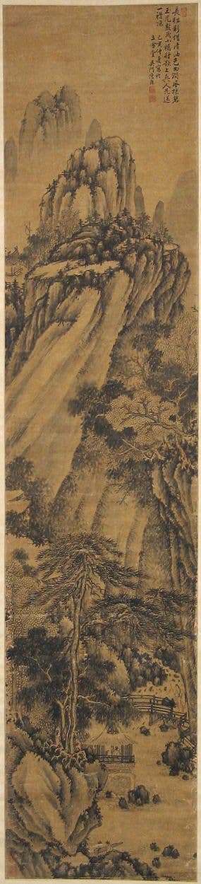
Yes. He trained as a painter under Huang Binhong and painted landscape throughout his life, and he also wrote classical poetry. His own ranking of himself placed poetry first. The market has reversed that order entirely, and the calligraphy is what collectors pursue, but the paintings are worth looking at for the light they throw on where the ink technique comes from.
Is his calligraphy readable by a non-specialist?
More than most wild cursive. Character forms are usually complete enough to be identified by anyone who can read cursive, and much of the content is classical poetry, which means published transcriptions exist for many works. If you cannot read it at all, that is not a warning sign in itself, but you should have the text transcribed before buying, since a misquoted or garbled poem is a strong indication of a copyist at work.
How does he compare with Yu Youren?
They pull in opposite directions. Yu Youren spent his later career standardising cursive into a clear, teachable, deliberately regular system. Lin Sanzhi went the other way, towards maximum variability of ink and line. Both are collected, and a shelf holding one of each shows the two poles of twentieth-century cursive practice more clearly than any amount of description.
Further reading
- Chinese cursive script: a guide to caoshu - the script itself, its grades and how to read it.
- Yu Youren and standard cursive - the opposite twentieth-century answer to the same problem.
- Huang Binhong's five brush and seven ink methods - the ink vocabulary Lin Sanzhi learned from his teacher and carried into writing.
- Qi Gong: a collector's guide - the other calligrapher of the period whose work collectors most often weigh against his.
Browse the collection
Kiln and Ink publishes limited-edition archival giclee reproductions of the twentieth-century Chinese ink masters, hand-numbered and issued with a Certificate of Authenticity. Calligraphy of this kind is a subject we write about rather than one we stock, but the ink sensibility behind it runs directly through the painters we do reproduce, Huang Binhong above all. Browse the full collection to see where the same handling of wet and dry ink turns up in landscape.
Explore Further