Published August 13, 2026
Caoshu explained: the zhangcao, jincao and wild cursive scripts, how cursive abbreviations work, and how to judge real brush control at speed.
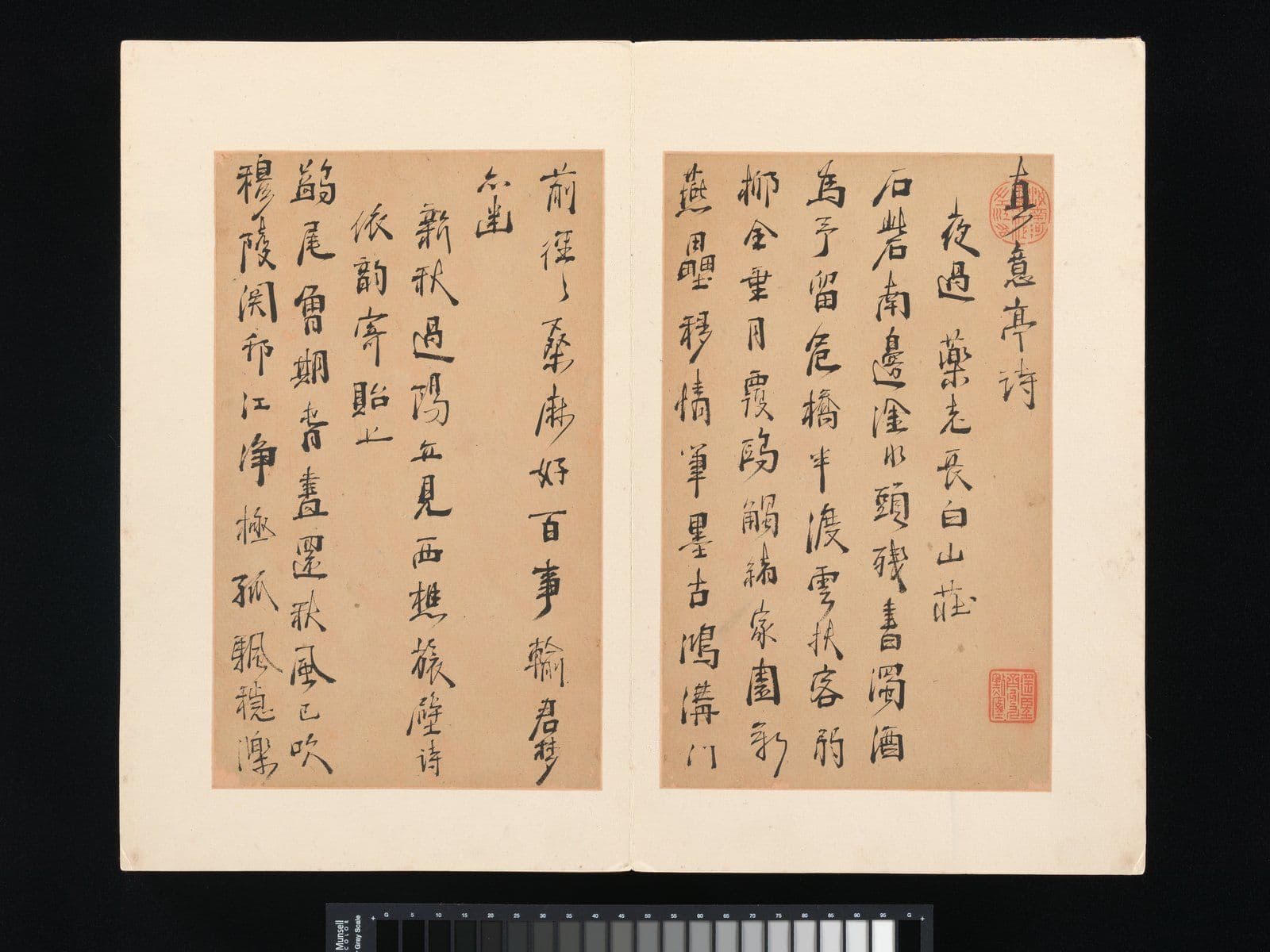
Stand in front of a cursive-script scroll and the first honest reaction is usually that you cannot read it — and neither, without training, can most native readers of Chinese. Characters have collapsed into loops and gestures; some run into each other; a few seem to be missing entirely. It looks like abandon. It is nothing of the sort. Caoshu, the cursive hand, is a rule-bound abbreviation system several centuries older than the printed forms most learners meet first, and among calligraphers it is regarded as the hardest of the five scripts to do well — the one where speed strips away every place to hide.
This guide explains how cursive actually works: the abbreviation logic, the three families a collector will hear named, the Tang masters who defined its wild extreme, and the concrete things to look at when judging a cursive work on a wall or in a catalogue.
An abbreviation system, not a scribble
The essential fact about caoshu is that its forms are conventional. Each character has an accepted cursive abbreviation — a fixed shorthand that compresses a many-stroke structure into one or two connected gestures — and calligraphers learn those forms the way they learn the characters themselves. A writer cannot improvise a new squiggle and call it cursive, any more than an English writer can invent a new spelling and call it shorthand. The compression sits inside a shared code.
That is why cursive is legible to the trained and opaque to everyone else, and why it functions as a connoisseurship test. A forger or an untrained hand produces forms that are vague where they should be precise: the loop that stands for a particular component drifts into the loop that stands for a different one, or a gesture is fudged where the writer did not actually know the abbreviation. Reading cursive form-by-form takes years, but even a collector who never learns to read it can learn to see decision — genuine cursive is fast and certain, imitation cursive is fast and approximate.
Within the five-script family, cursive sits at the far end of the compression scale: seal script is the archaic hand, clerical the Han administrative hand, regular the fully articulated standard, running a moderate everyday compression — and cursive the maximum, where writing approaches drawing.
The three cursive families
"Cursive" covers three related but distinct traditions, and sale catalogues use all three names:
| Family | Emerged | What it looks like | The tell ||---|---|---|---|| Draft cursive (zhangcao) | Han dynasty | Abbreviated forms, but each character separate; strokes keep a clerical-style wave | The oldest type — compression without connection || Modern cursive (jincao) | From around the fourth century | Characters fully cursive, strokes linked within characters, occasional links between them | The classical mainstream of the tradition || Wild cursive (kuangcao) | Tang dynasty | Characters run together in long connected passages; extreme size and speed swings | The virtuoso extreme — writing as performance |
Draft cursive grew directly out of quick clerical writing — it keeps the flattened posture and the flaring wave stroke of clerical script, which is the fastest way to recognize it. Modern cursive, refined in the classical tradition associated with Wang Xizhi and his circle, is what most surviving cursive masterworks and most later practice belong to. Wild cursive is the smallest and most spectacular branch, and it is the one that gives cursive its popular image.
The Tang wildmen — and what their freedom was built on
Wild cursive is inseparable from two Tang-dynasty names: Zhang Xu and the monk Huaisu, remembered in the tradition as its twin peaks — the one famous for writing after wine, the other a Buddhist monk whose ink discipline was itself legendary. Huaisu's Autobiography scroll, the most celebrated wild-cursive work to survive, runs its text in torrents: characters swelling and shrinking, columns swaying, the brush plainly recharged with ink and then driven until it runs dry, the pale dragged strokes recording the exact rhythm of the writing session like a seismograph.
The tradition's judgment on these works is precise, and it is the opposite of "anything goes." The freedom was earned: both masters were rigorously trained in the standard hands, and inside the apparent frenzy every abbreviation is correct, every character recoverable by a trained reader. That is the entire aesthetic argument of wild cursive — maximum liberty over an intact skeleton of rules. Later centuries produced wild-cursive writers of real power, but also a long tail of imitators who copied the frenzy without the skeleton, and telling those apart is exactly the collector's problem today.
How to judge a cursive work
Concrete things to look at, in roughly the order a specialist looks:
- Continuity of energy. Follow the ink down a column. Genuine cursive reads as one sustained decision — accelerations and rests, but no dead spots where the writer paused to think mid-gesture. Hesitation shows as slight thickening, wobble, or a join that does not flow.
- The ink cycle. A cursive writer loads the brush, writes until it dries, and reloads. Look for that rhythm: saturated wet openings, the gradual drying to streaked "flying white" where paper shows through the stroke, then a fresh recharge. Imitations often show suspiciously even ink — a sign of slow, careful copying of something that was originally fast.
- Structure under the speed. Even without reading, check that repeated characters (they recur often in poems) take the same abbreviated form each time. Consistency of forms is the cheapest proxy for a writer who actually knew the code.
- Column breathing. Good cursive manages the white space: columns sway but do not collide, large characters are answered by small, dense passages by open ones. Muddled spacing is a hand out of its depth.
- Signature, date and seals. Read as for any work: the signature is usually in the same hand and session, the seals should match documented examples. Our guide to collecting Chinese calligraphy covers the market-side checks — publication, provenance, condition — that apply to cursive exactly as to every other script.
One warning specific to this field: because cursive looks spontaneous, buyers assume it is hard to fake. The opposite is true. A practiced copyist can produce plausible frenzy far more easily than plausible regular script, since small errors hide inside the speed. The market treats big-name cursive attributions with corresponding suspicion, and so should you.
Where a collector actually meets cursive
Full cursive is a minority of what circulates. The inscriptions on paintings are overwhelmingly in running script — the everyday compromise hand — with cursive flavour at most. Standalone cursive calligraphy comes chiefly as hanging scrolls and handscrolls of poems, and as letters: personal correspondence was historically written fast, and collected letters by famous hands are a classical category of calligraphy collecting in their own right.
In the twentieth century the script had a genuine modern life. Yu Youren worked to systematize the abbreviations into a "standard cursive" for modern use, and Lin Sanzhi's late cursive — slow, dry, trembling with control — made him one of the most admired calligraphers of the century's second half. Among the roster masters at Kiln & Ink, the instructive contrast is Qi Gong, whose celebrated hand sits at the opposite pole — upright, slender, measured — and whose Mist Shining in the Sun shows how much expressive range exists inside the disciplined end of the spectrum; seeing both poles is the fastest way to calibrate your eye for what speed does and does not excuse.
For sourcing cursive works themselves: museum collections in China and Taiwan hold the anchors, the auction market supplies later and modern material, and the same rule applies as everywhere in this field — buy the documented, not the dramatic.
Common questions
Can native Chinese readers read cursive script?
Mostly not, beyond isolated characters. Cursive abbreviations are a learned system, closer to a specialist notation than to everyday handwriting, and reading it fluently is a trained skill even for calligraphers. This is normal and historical — cursive was always a hand for connoisseurs, poets and correspondents, not for public documents.
What is the difference between running script and cursive script?
Degree and system. Running script (xingshu) is ordinary writing sped up — strokes merge and simplify, but character structures stay close to the standard forms, so any literate reader can follow it. Cursive replaces structures wholesale with fixed abbreviations and links them, which is faster still but breaks casual legibility. Running is the everyday hand; cursive is the specialist's.
Is wild cursive just expressive abstract art?
It reads that way to modern eyes, and its influence on twentieth-century abstraction is real. But historically, no: under the frenzy, wild cursive keeps every abbreviation correct and recoverable. The tradition's admiration is precisely for freedom exercised over intact rules — frenzy alone, without the skeleton, was and is judged as failure.
Is cursive calligraphy a good place to start collecting?
It is one of the harder places, because quality judgment leans heavily on trained eyes and the fake risk is high for big names. Letters and works by documented modern masters are a saner entry than dramatic attributions to famous historical hands. Start by looking — published masterworks, museum rotations — before buying.
Further reading
- The Five Scripts of Chinese Calligraphy — the family map this deep dive plugs into.
- Seal Script (Zhuanshu): Reading the Oldest Chinese Hand — the opposite end of the speed spectrum.
- Clerical Script (Lishu): The Hand That Replaced the Seal — the Han hand whose quick form became draft cursive.
- Collecting Chinese Calligraphy: Scripts, Formats and Value — the buying-side companion: formats, value drivers, checks.
Browse the collection
Calligraphy at its most disciplined is part of what Kiln & Ink publishes: limited-edition archival giclée reproductions of the twentieth-century masters — including Qi Gong's celebrated hand — on xuan paper or museum-grade cotton rag, hand-numbered with a Certificate of Authenticity, at the collection.
Explore Further