Published October 27, 2026
Chinese blue-green landscape explained: how azurite and malachite are ground and laid, why the literati demoted colour, and the condition checks that matter.
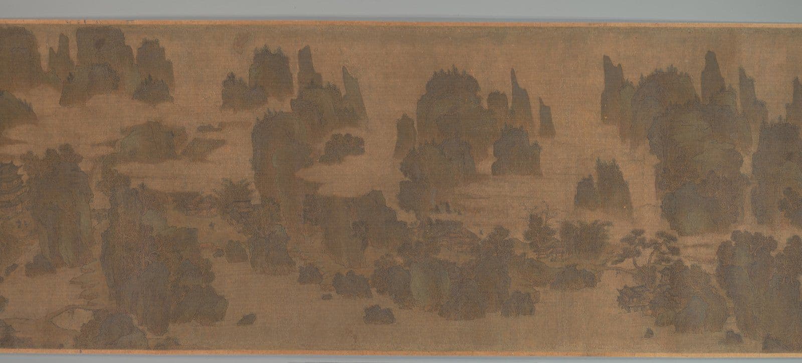
A handscroll opens a foot at a time, and the first thing that arrives is blue: a peak of azurite so dense it reads as a solid rather than a wash, sitting on the silk instead of in it. Then the green, malachite laid in bands along the slopes, bright where the silk is bare and dulled where the glue beneath has yellowed. The ink is almost an afterthought — a thin contour under the colour, a few trees, a bridge with two figures on it. Tilt the section towards a window and the mineral layer throws a shadow of its own.
That shadow is the tradition's signature. Blue-green landscape is the oldest continuous colour mode in Chinese painting, and the only one where the pigment is thick enough to be an object in its own right.
This guide walks you through what qinglü shanshui means, how azurite and malachite are ground and laid, why the Tang court made colour a language of empire and why the literati demoted it, what A Thousand Li of Rivers and Mountains demonstrates, how the mode survived to Zhang Daqian, and the condition checks that decide what a blue-green painting is worth.
What qinglü shanshui means
Qinglü shanshui, "blue-green mountain-water", names a palette rather than a school. Any painter could use it, and most did at some point: it appears on Tang tomb walls, Song handscrolls, Ming fans and twentieth-century paper. What defines the mode is that the mountains are built from mineral colour rather than from ink texture, and that the colour is not descriptive. Real hills are not azurite. The blue and green describe an ideal terrain — the country of immortals, the emperor's domains, the mountain that a scholar never quite reaches.
Two variants matter. Plain qinglü uses azurite and malachite with ink contour and little else. Jinbi, "gold-and-blue-green", adds gold: gold outlines on the ridges, gold leaf in the clouds, sometimes a gold ground. Jinbi is the more courtly and more expensive of the two, and it is the version most often copied badly.
The mode sits inside the larger landscape tradition described in how to read a Chinese landscape, but it asks a different thing of the eye. An ink landscape is read for brushwork — the texture strokes that build a rock. A blue-green landscape is read for structure and for surface.
Azurite and malachite: how the minerals behave
The two blues and greens are both basic copper carbonates, and they come out of the same ground. Azurite, shiqing, is the deeper blue; malachite, shilü, the green. Both are crushed, washed and levigated into grades — touqing, "head blue", is the coarsest and darkest, then erqing, then sanqing, the palest. The painter buys them as powder and binds them with animal glue.
Three consequences follow, and every one of them matters at the point of sale.
- The colour sits proud. A coarse mineral particle does not sink into silk. It lies on the surface in a layer that catches light and casts a faint edge.
- The layer cracks. Glue embrittles. Roll a scroll a few hundred times and the mineral film breaks along the folds, then lifts.
- The back is painted too. On silk, the reverse is often coloured as well, so the blue reads saturated without the ink drawing being buried. This is why a relined scroll can lose colour it never had on the front.
The wider chemistry, including the pigments used for flesh and rock, is set out in Chinese painting's mineral pigments. For the collector, the practical point is that flaking is a property of the material, not a defect introduced by neglect.
The Li school and the literati reaction
Colour landscape enters the record in the Tang, with Li Sixun and his son Li Zhaodao. Their manner — ink outline first, mineral fill second, gold accent last, all of it held inside the drawn edge — became the Li school, and it stayed the court's default for centuries. The Song academy painted it; the Yuan kept it for figures and archaic exercises. It never disappeared.
What changed was its status. In the late Ming, Dong Qichang drew a line through the whole history of painting and put Wang Wei's monochrome ink at the top of it and Li Sixun's colour at the bottom. The Southern school was scholar-amateur and therefore virtuous; the Northern school was professional, decorative and, by implication, lesser. The argument was self-serving and it worked. For three hundred years, catalogues and collectors repeated it, and blue-green painting was priced as craft while ink was priced as thought.
That hierarchy is the single most useful thing to know about the market, because it is now inverted at the top end. A first-rate Ming blue-green is worth more than a routine literati scroll of the same date, and has been since the 1990s.
A Thousand Li of Rivers and Mountains
The benchmark is a single handscroll: A Thousand Li of Rivers and Mountains, painted on silk in 1113 by Wang Ximeng, then eighteen, and now in the Palace Museum in Beijing. It is the most complete surviving statement of what the mode can do, and it repays an hour of close looking more than any amount of reading.
Three things to notice. First, the blue is not decoration applied to a finished drawing; it carries distance. Near slopes are green, middle ground is green over blue, far peaks are azurite alone, and the eye reads depth from the colour shift before it reads it from scale. Second, the mineral layer is built in successive thin passes, each allowed to dry, so the colour has body without opacity. Third, the ink never disappears. Every ridge still has its line, and the line is what holds the composition together when the colour has faded.
If you see a later blue-green painting where the ink has been redrawn on top of the colour, you are looking at a copy or a reconstruction, not a descendant.
The Ming revival
The mode came back into fashion in the sixteenth century, in Suzhou, for reasons that were mostly social. Blue-green suits the formats that gift-giving demanded — the fan, the album leaf, the screen, the birthday scroll — because it reads at a distance and photographs well as an object. Qiu Ying painted it professionally and beautifully. Wen Zhengming used it when a commission called for splendour rather than for the scholar's grey.
The Ming version differs from the Song in two ways you can see without instruments. The colour is thinner, often a single pass of erqing rather than three of touqing. And the support is more often paper, which takes mineral colour less well than silk: the layer sits higher, flakes sooner, and stains the sheet where it has lifted.
By the eighteenth century it had moved to the decorative workshop, surviving on folding screens and export wares — less a decline in skill than a change of client.
Zhang Daqian and the modern blue-green
The twentieth century is where the mode became collectable again. Zhang Daqian (1899–1983) began as a copyist, including years at Dunhuang studying mural colour, and ended by pouring mineral blue and green onto paper in the splashed works of his last two decades. The poured colour is the same azurite and malachite, at the same strength, handled in a way no Ming painter would have permitted. The lineage is traced in Zhang Daqian's splashed ink revolution.
Around him, Wu Hufan, Pu Ru and Lu Yanshao kept the classical mode alive as a deliberate archaism, painting blue-green for collectors who wanted the old language spoken correctly. Lu Yanshao's version is the most muscular of the three, and the least imitated, which is a quiet advantage when you are buying.
Nineteenth-century blue-green is thin on the ground and heavily restored; twentieth-century work by a named painter is abundant, documented and comparatively liquid. If you want to own the mode rather than a specimen of it, this is where the supply is.
How to read a blue-green painting
Look in a fixed order, and do not skip the first step.
- Read the support first. Silk or paper, and how the colour sits. On silk the mineral layer should look embedded in the weave; on paper it should read as a film, with the sheet's texture visible at the edges of each pass.
- Then read the blue in grades. A trained hand moves from touqing at the ridge to sanqing at the foot of the same mountain. A single flat blue across a whole peak is a later hand or a cheap one.
- Check where the contour sits. The ink line belongs under the colour, interrupted by it. If the line runs cleanly over the blue, the drawing was made after the painting.
- Look at the green for yellowing. Malachite dulls towards olive as the glue ages. An even, cold, mint-green across a supposedly old surface is a warning.
- Find the gold, if there is any. Gold leaf in jinbi is applied last and sits highest. Genuine gold does not tarnish; brass powder does, and goes brown at the edges.
Condition, restoration and the common fake
Blue-green painting is restored more often than ink painting: a lost patch of azurite is more visible than a lost patch of wash. Assume intervention until you have proved otherwise.
- Flake loss along the roll. Normal, and not a reason to walk away. Loss that follows the fold lines is period damage; loss in the middle of a flat passage is usually a repair that failed.
- Repainted losses. Modern azurite is brighter and more evenly ground than anything made before 1900. Under ultraviolet light, the new animal glue in a repainted patch fluoresces milky where the old surface stays dark.
- Aniline blue. Synthetic dye, available from the late nineteenth century, stains the fibre instead of sitting on it. It looks flat under raking light and bleeds at the edges of a stain.
- The photographic copy. Colour lithographs and later halftone prints of famous blue-green scrolls were sold as reproductions and are now occasionally offered as paintings. Look for a uniform dot pattern under magnification and a paper edge that is too regular.
- The married handscroll. A later colophon and a period painting joined to make a longer, more impressive object. Check that the mounting silk at the join matches, and read the mounting conventions before you accept a restorer's explanation.
What the market pays follows condition before it follows name. A Ming blue-green with honest flake loss and an intact ink layer will outperform a repainted example of the same hand every time, and a repainted Zhang Daqian is worth less than a clean one by a wide margin. Buy the surface, then the signature.
Common questions
Is blue-green landscape older than ink landscape?
Yes, as a courtly mode. Mineral colour on tomb walls and on silk predates the literati ink landscape by centuries, and the Li school was established before Wang Wei's monochrome was written up as a lineage. Ink landscape became dominant in criticism, not in chronology.
Why did Chinese painters stop using blue and green?
They did not stop; the mode lost prestige. Dong Qichang's late-Ming division of painting into scholar and professional lineages coded mineral colour as artisanal, and collectors followed the criticism. Painters kept using it for screens, fans, gifts and court commissions throughout the Qing.
How can you tell whether the blue is real azurite?
Under magnification, ground azurite shows angular translucent particles of uneven size, and the layer has thickness. Synthetic blues are uniform in grain and flat in the light. Ultraviolet examination helps with the binder rather than the pigment: new glue fluoresces, old glue does not.
What is the difference between qinglü and jinbi?
Qinglü is blue and green mineral colour with ink contour. Jinbi adds gold — outlines on the ridges, gold in the clouds, sometimes a gold ground — and belongs to the more formal, court-oriented end of the mode. Jinbi is rarer, more copied, and harder to authenticate from a photograph.
Further reading
- Lu Yanshao's Landscape Paintings — the twentieth-century blue-green at its most physical.
- Zhang Daqian: A Collector's Guide — the career that made mineral colour collectable again.
- Copies in the Chinese Tradition — why a good copy is not a forgery, and where the line falls.
- Provenance Documents for Chinese Art — what paperwork should accompany a scroll of this value.
Browse the collection
Blue-green landscape is a tradition we write about more than one we stock in original form. What Kiln & Ink publishes is the twentieth-century ink tradition in archival giclée — limited editions, hand-numbered, with a Certificate of Authenticity — including the colour-washed landscapes of the masters who kept the mode alive when the academies had abandoned it. Browse the collection to see what is currently available.
Explore Further