Published October 29, 2026
How Chinese ink reads against limewash and oak, which mounts and frames suit Japandi rooms, and the details that make a good scroll look wrong.
Hold a small ink landscape against a limewashed wall at four in the afternoon and the paper stops behaving like paper. The grey wash in the mid-ground sits somewhere between the wall and the room. The unpainted margins, which looked so emphatically blank on a table, disappear. That disappearance is the entire argument for hanging Chinese ink in a Japandi interior, and it is also where most attempts go wrong: let a gold-flecked mount or a column of vermilion seals into the frame and the paper comes back, the wall goes quiet in the wrong way, and the room starts to look like a shop.
This guide walks you through what Japandi actually asks of a wall, why monochrome ink answers it better than most things you could hang, which Chinese conventions fight the style, how to choose frames and mounts, how to size and place a single work, how to group two or three, and how to protect paper once it is up.
What Japandi asks of a wall
Japandi is a working compromise between Japanese restraint and Scandinavian usefulness. In practice that means a low-contrast palette, natural materials left visible — oak, ash, limewash, linen, stoneware, wool — and negative space treated as a material in its own right. Walls are rarely pure white. They are off-white, clay, bone, pale grey, occasionally a deep charcoal in a small room.
The style tolerates exactly one focal object per wall, and it tolerates imperfection: a deckled edge, a faint cockle in the paper, a repair done honestly a century ago. What it does not tolerate is shine, ornament, or a second competing colour. Those three exclusions decide most of the choices that follow.
Why ink on paper belongs in that palette
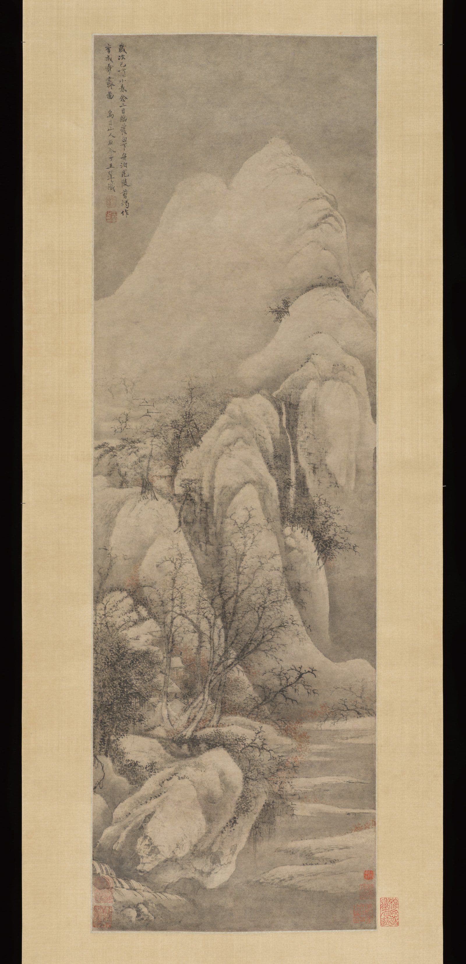
Ink is one pigment suspended in water. Chinese painters worked it in five recognised tones — jiao, nong, zhong, dan, qing, roughly burnt, dense, medium, pale and clear — and built the whole picture from dilution rather than from hue. Xuan paper takes the wash in and softens the edge, so tone arrives with texture attached.
That is the same logic as limewash on plaster or the slub in raw linen: one material, many values, no gloss. A monochrome landscape asks nothing of a room except a wall and a little distance. If you are new to the format itself, the hanging scroll guide explains how the mounting, the rod and the weight at the bottom all affect how the work sits.
There is a second reason, less often said. Chinese ink has an unusually wide tonal range in a narrow chromatic one. On a clay wall the darkest passages read as architecture — a doorway, a window — while the pale washes dissolve. Few other media give a low-contrast room both a focal point and camouflage from the same sheet.
Where Chinese ink clashes with Japandi
The clashes are consistent, and they are worth naming before you buy rather than after you hang.
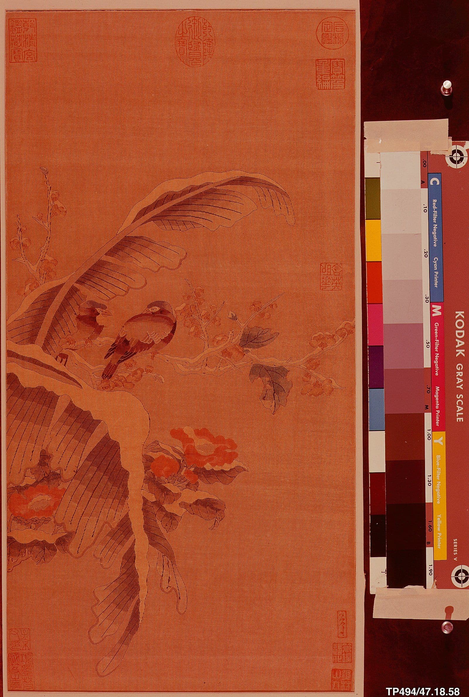
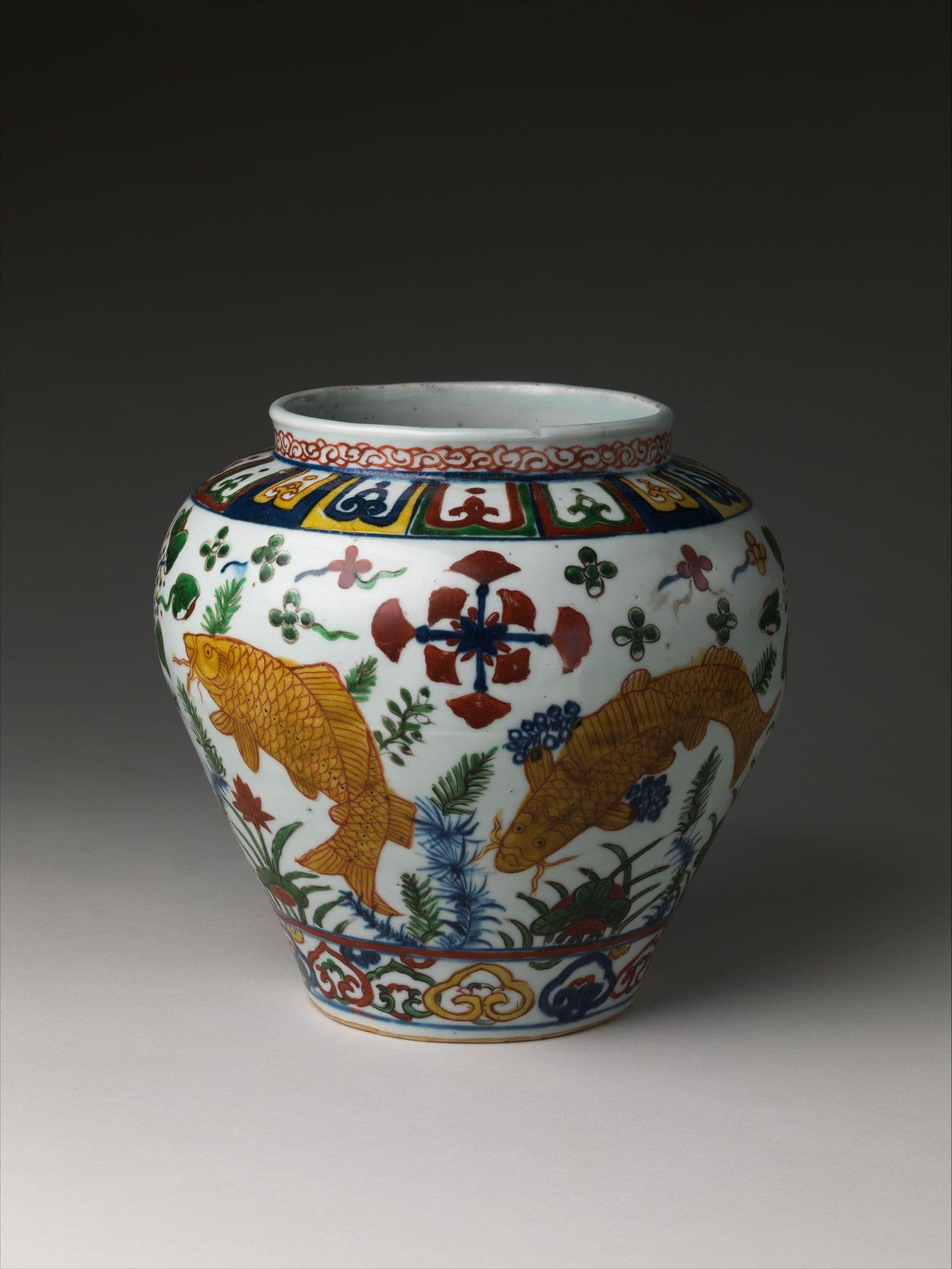
- Mineral colour. Azurite blue, malachite green and cinnabar red were expensive and are emphatic. A blue-and-green landscape is a beautiful object and a poor fit for a room built on two neutrals.
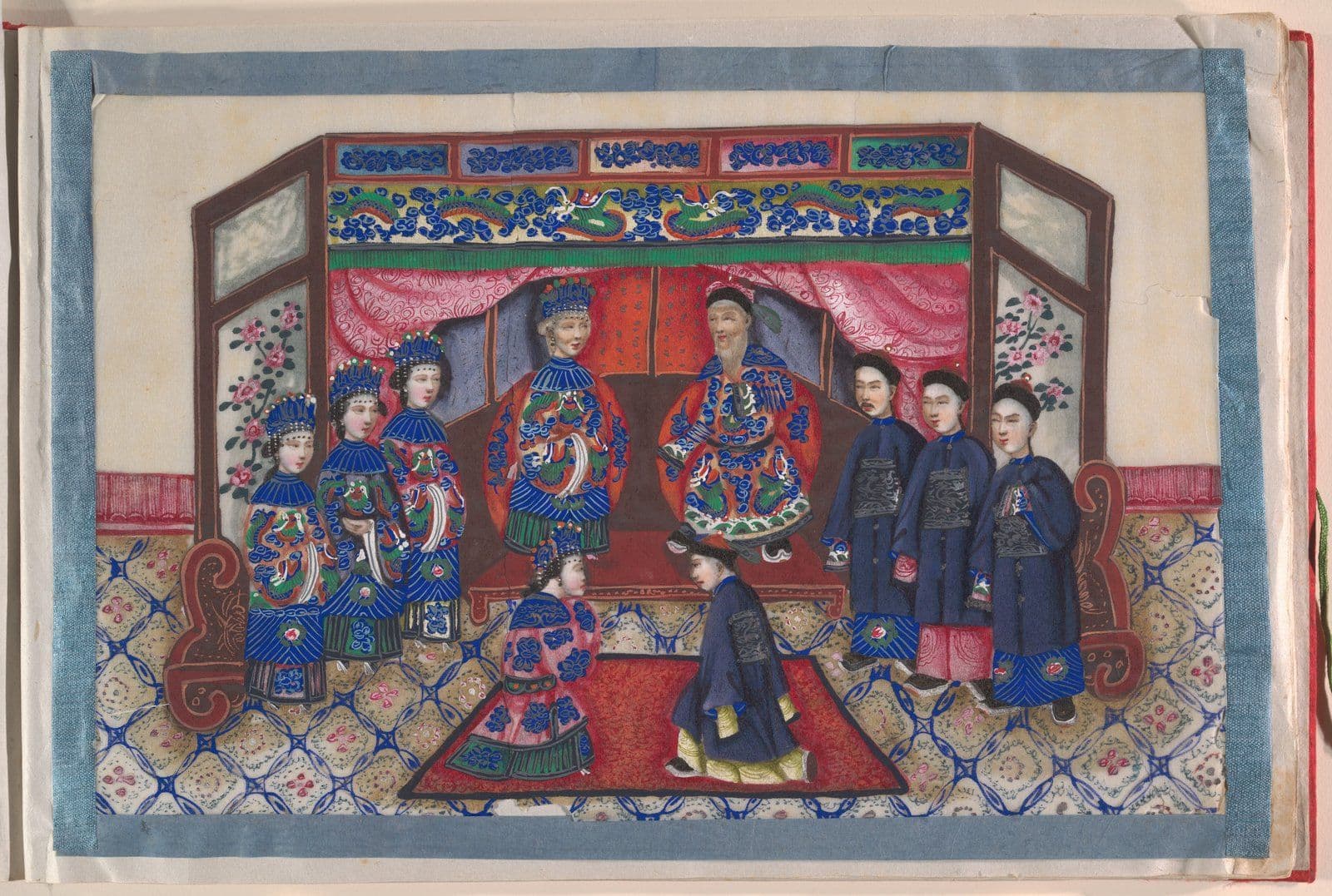
- Gold. Gold-flecked paper, gold leaf, gold brocade mounts. Metallic reflection contradicts every matte surface in the room.
- Full coverage. Compositions that fill the sheet edge to edge leave no negative space, which is the one thing Japandi cannot manufacture for you.
- Ornate framing. Carved mouldings, black lacquer with gilt slips, deep gilded liners. These belong to a different century and a different room.
- Seal clusters. One seal is a full stop. Six seals and three colophons in bright vermilion are a colour event, and they will out-shout the painting.
- Formal symmetry. A matched pair of scrolls flanking a central work in identical brocade reads ceremonial. Japandi reads relaxed.
None of this makes the excluded works worse. It makes them wrong for this wall.
Reading ink tones against pale walls
Contrast is decided by the wall, not by the painting. On pure white, pale washes vanish and the work looks underfed. On clay or limestone, the same wash holds, because the wall is already a tone. Dense black on a very pale wall becomes a hole — effective when it is the only thing on that wall, oppressive when it is one of four.
Two practical tests. Photograph the work flat, then photograph it again held against the actual wall in the actual light, and compare. Then stand back three metres and squint: whatever survives the squint is what the room will see. Works built on mid-tones survive best. Very pale works want either a darker wall or a wider paper margin to hold them.
Frames, mounts and the question of silk
Three honest options.
A traditional hanging scroll needs no frame at all. It hangs from a rod, weighted at the foot, and wants 20cm of clearance above and a hook rated for more than you think. It also wants a wall that is not above a radiator.
A float mount in a deep box frame — oak or ash, thin profile, 25 to 40mm deep — holds the sheet away from the glazing and lets the deckled edge show. This is the option that most often looks right in a Japandi room, because the timber does the work the brocade would have done.
A wide rag mat, off-white, weighted slightly deeper at the bottom, suits works on paper that need breathing room. Keep the mat width in proportion: 8 to 10cm on a small sheet, more on a large one.
On silk: if the brocade mount is original and sound, keep it. It is part of the object and its condition is part of its value. If you are framing a reproduction, a paper border in the same tone as the sheet is the calmer choice. Either way, specify archival materials — the difference between a print that lasts forty years and one that lasts four hundred is mostly the board behind it, as set out in this note on archival papers and giclée longevity.
Two details decide whether the result looks considered or improvised. The first is the reveal: how much paper shows between the edge of the sheet and the frame. Two centimetres reads as a mistake; five to seven reads as a decision. The second is the frame depth. A shallow frame presses the work against the glazing and flattens it, while a deep one lets the sheet sit in its own shadow, which is what makes paper look like an object rather than a picture.
Scale, height and the single-work wall
One work, one wall. Resist the urge to fill the remaining space; the space is doing a job.
Width: aim for 40 to 60 per cent of the width of the piece of furniture below, not of the wall. A console two metres wide takes a work roughly 0.9 to 1.2 metres wide. Height: centre the work at 145 to 150cm from the floor, which is eye level for a standing adult and slightly high for a seated one — the right compromise in a room used both ways.
A vertical scroll in a low room should clear the furniture below by 20 to 25cm. If it does not, the work is too tall for the wall, and no amount of adjustment will fix it. A small sheet on a large wall looks like a stamp; group it instead of hanging it alone.
Pairs, sets and the asymmetric group
The Chinese convention is a matched pair of couplets flanking a central painting, hung symmetrically at identical height. It is a formal arrangement with a long history, and it fights a Japandi room.
The calmer move is asymmetry with a shared edge. Two works of unequal size, aligned along one vertical edge, separated by 5 to 8cm. Or three works with centres on one line and heights deliberately uneven. Album leaves work well as a row of four or six, equal gaps, identical frames — repetition instead of symmetry.
Whatever you choose, keep the gaps smaller than you instinct tells you. Loose spacing reads as indecision; tight spacing reads as a set. More on the wider question of placement is in displaying Chinese art at home.
Light, glazing and the paper's future
Carbon ink is a stable pigment. Paper is not. Xuan paper yellows, cockles and embrittles under ultraviolet light and swings in humidity, and the damage is cumulative and irreversible.
Keep the work off direct sun entirely, and off walls that receive more than an hour of it. Ambient light of 50 to 100 lux is ample for a domestic room. Use LED sources with low UV output, and keep spotlights far enough back that the beam does not bake one patch of the sheet.
Glazing should carry a UV filter. Acrylic is lighter and safer above a sofa; glass scratches less. Target 45 to 55 per cent relative humidity, which in most houses means avoiding bathrooms, kitchens and the wall above a radiator. Reframe with acid-free board rather than board of unknown origin — the reverse of a work is where the cheap decisions show first. The Nordic home piece covers the same physics in a cooler palette.
Common questions
Can you hang a Chinese scroll painting in a Japandi room?
Yes, and monochrome landscapes suit it best. Choose a work with generous unpainted margins, keep the mount simple, and give it a wall of its own. The risk is not the painting; it is the brocade, the gold and the seals, which is where the clashes concentrate.
What frame suits Chinese ink art in a Scandinavian interior?
A thin oak or ash box frame with a float mount, 25 to 40mm deep, no liner and no ornament. Let the deckled edge show and keep the glazing off the paper. Black lacquer and gilt slips are the two choices to avoid.
Is Chinese ink art the same as Japanese sumi-e?
No. They share materials — ink, brush, absorbent paper — but differ in intent. Sumi-e tends toward abbreviated gesture and Zen subject matter; Chinese literati painting carries calligraphic brushwork, inscribed poetry and a long tradition of copying and colophon. The tonal logic is related; the reading habits are not.
How high should a hanging scroll be hung?
Centre the work at 145 to 150cm from the floor. On a scroll, the bottom edge should clear furniture by 20 to 25cm, and the rod needs 20cm of clearance above for the hanging cord. In a room with high ceilings, hang to the furniture rather than to the ceiling line.
Further reading
- Hanging and lighting framed prints at home — the lighting and height calculations in more detail.
- How to display a Chinese scroll painting — rod, cord and seasonal rotation for works on paper.
- Chinese ink painting versus watercolour — why the two media behave differently under the same brush.
- Chinese album leaves and fan paintings — why small sheets work as a row, and how sets get broken up.
Browse the collection
Kiln & Ink publishes limited-edition archival giclée reproductions of twentieth-century Chinese ink masters, hand-numbered and issued with a Certificate of Authenticity — printed on paper chosen to hold tone the way the originals do. Browse the collection for landscape and bird-and-flower work, or start with Zhang Daqian and Li Keran, whose splashed and dense ink passages read particularly well against a clay wall.
Explore Further